Case Study: Revamping 21st Century Glaziers Website
Client Overview: 21st Century Glaziers is a leading glazing company based in the UK, offering a wide range of glass and glazing solutions for both commercial and domestic clients. With a reputation for quality craftsmanship and exceptional customer service, they approached us with the goal of redesigning their website to better appeal to their target audience and streamline the enquiry process.
Client Brief: The client’s primary objective was to have a website that would cater to both commercial and domestic customers. They wanted the design to be modern, visually appealing, and easy to navigate. Additionally, they emphasized the importance of having a custom enquiry form that would allow potential customers to easily submit their requirements.
Challenges:
- Appealing to Diverse Audiences: Balancing the needs and preferences of both commercial and domestic customers within the website design.
- Streamlining Enquiry Process: Creating a custom enquiry form that is user-friendly and encourages visitors to submit their enquiries effortlessly.
- Maintaining Brand Identity: Ensuring that the new website design aligns with the brand’s identity and values while incorporating modern elements to enhance user experience.
Solution:
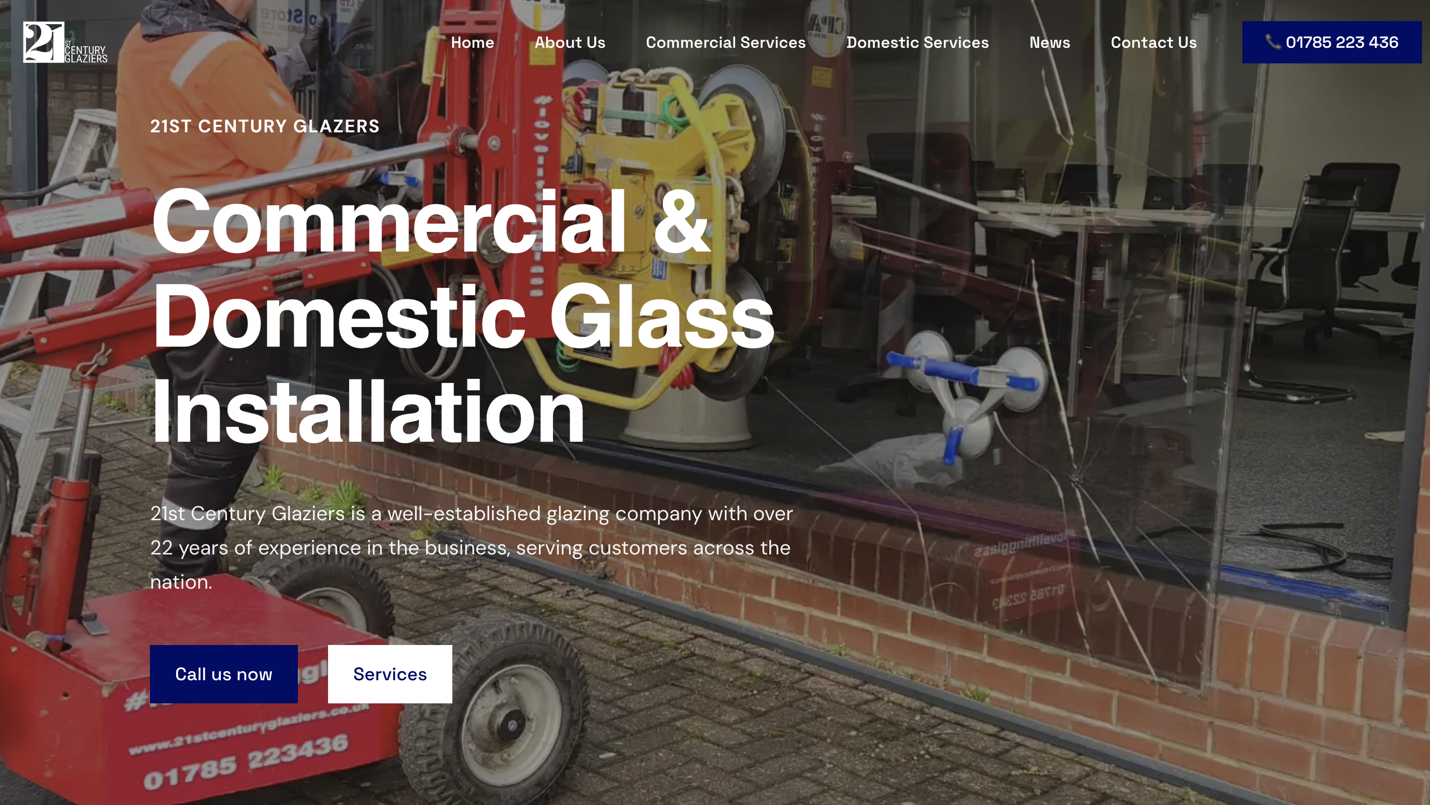
1. Audience-Centric Design: We conducted thorough research to understand the distinct needs and preferences of both commercial and domestic customers. Based on our findings, we devised a design strategy that incorporated elements appealing to both segments. This included clear navigation pathways for different types of services, featured projects showcasing both commercial and domestic installations, and tailored messaging to resonate with each audience.
2. Custom Enquiry Form: To streamline the enquiry process, we created a custom enquiry form that was prominently displayed on the website’s homepage as well as on relevant service pages. The form was designed to be intuitive and user-friendly, allowing visitors to quickly input their details and specific requirements. Additionally, we integrated validation checks to ensure that all necessary information was provided before submission.
3. Visual Redesign: While maintaining the core brand identity of 21st Century Glaziers, we modernized the visual elements of the website to create a more engaging user experience. This included updating the color palette, typography, and imagery to reflect contemporary design trends. We also incorporated high-quality photos of completed projects to showcase the company’s expertise and craftsmanship.
Results:
- Improved User Experience: The redesigned website received positive feedback from users, with many noting its ease of navigation and intuitive layout.
- Increased Enquiry Rate: The custom enquiry form proved to be effective in generating leads, with a noticeable increase in enquiries from both commercial and domestic customers.
- Enhanced Brand Perception: The modernized design helped to elevate the brand’s image, positioning 21st Century Glaziers as a trusted and professional provider of glass and glazing solutions.
Conclusion: By understanding the unique needs of 21st Century Glaziers’ target audience and implementing a tailored design approach, we were able to create a website that effectively appeals to both commercial and domestic customers. The incorporation of a custom enquiry form further streamlined the enquiry process, leading to an increase in leads and overall business growth. Moving forward, we will continue to monitor the website’s performance and make iterative improvements to ensure it remains a valuable asset for the client.


